Draw your architecture
Add components and arrows, group them in boundaries, open a component to see inside it, and switch how the diagram looks.
What you'll get
- A diagram of your system
- Components with real technologies
- Levels you can open
Add components
The Architecture tab is the main diagram. Every other tab builds on the components you draw here.
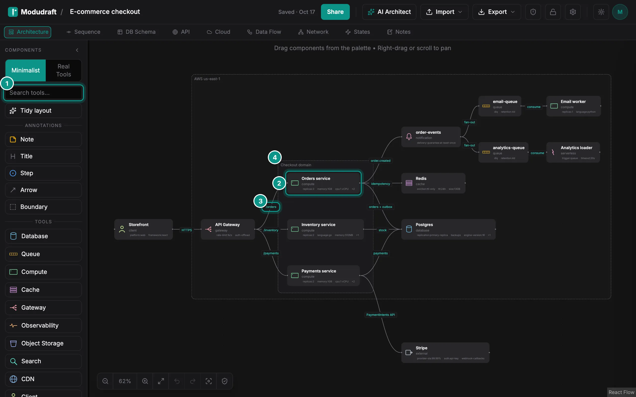
The palette on the left holds the building blocks: Database, Queue, Compute, Cache, Gateway and more. Click one to add it, or drag it onto the canvas. To find a specific technology, type in Search tools (1), for example “Kafka” or “PostgreSQL”.
The palette has two modes. Minimalist adds a component by its kind. Real Tools lets you pick the exact tool: click a kind to open its list, then click or drag a tool.
Each box on the canvas is a component, such as Orders service (2).
Connect them
To connect two components, drag from a dot on the edge of one component to the other. The arrow shows the connection, like the one from API Gateway to Orders service (3).
Click an arrow to edit it in the side panel. Type a label, or pick a protocol such as HTTPS, gRPC or WebSocket. You can also animate it, color it and give it your own properties.
The Arrow in the palette is different: it is a drawing for notes, not a connection between components.
Group with boundaries
A boundary draws a dashed box around related components, such as Checkout domain (4). Drag Boundary from the palette, then resize it around the components it holds. A component belongs to a boundary when its center is inside the box, and it moves with the boundary.
Inspect a component
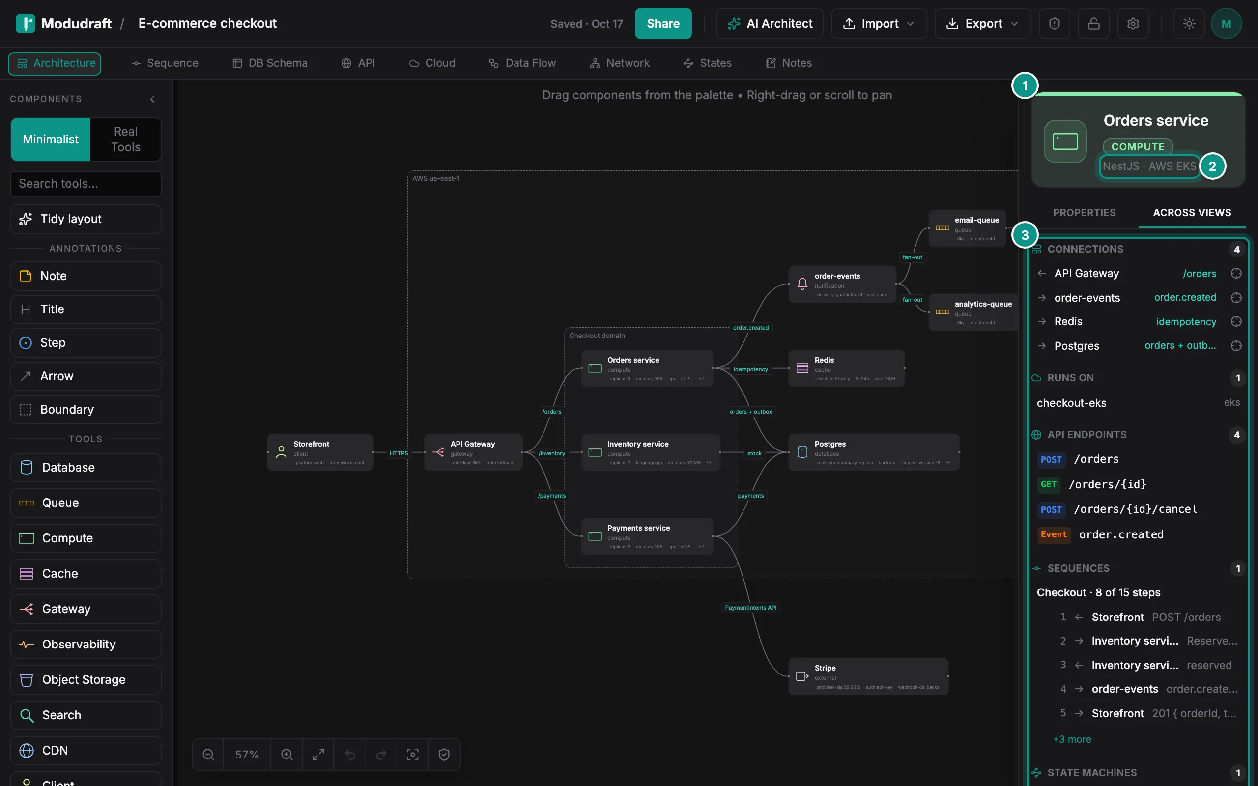
Click a component to open it in the side panel on the right. The top shows its name and kind (1), and its technology (2): the framework or language, and the tool.
The Properties tab holds the details. Pick the kind and the tool, choose the cloud resource it runs on, and add your own properties, such as replicas or memory. Some of them show on the box on the canvas.
The Across views tab (3) shows where the component appears in the other tabs: its connections, where it runs, its API endpoints and the sequences it takes part in. Click a row to go there.
Open a component
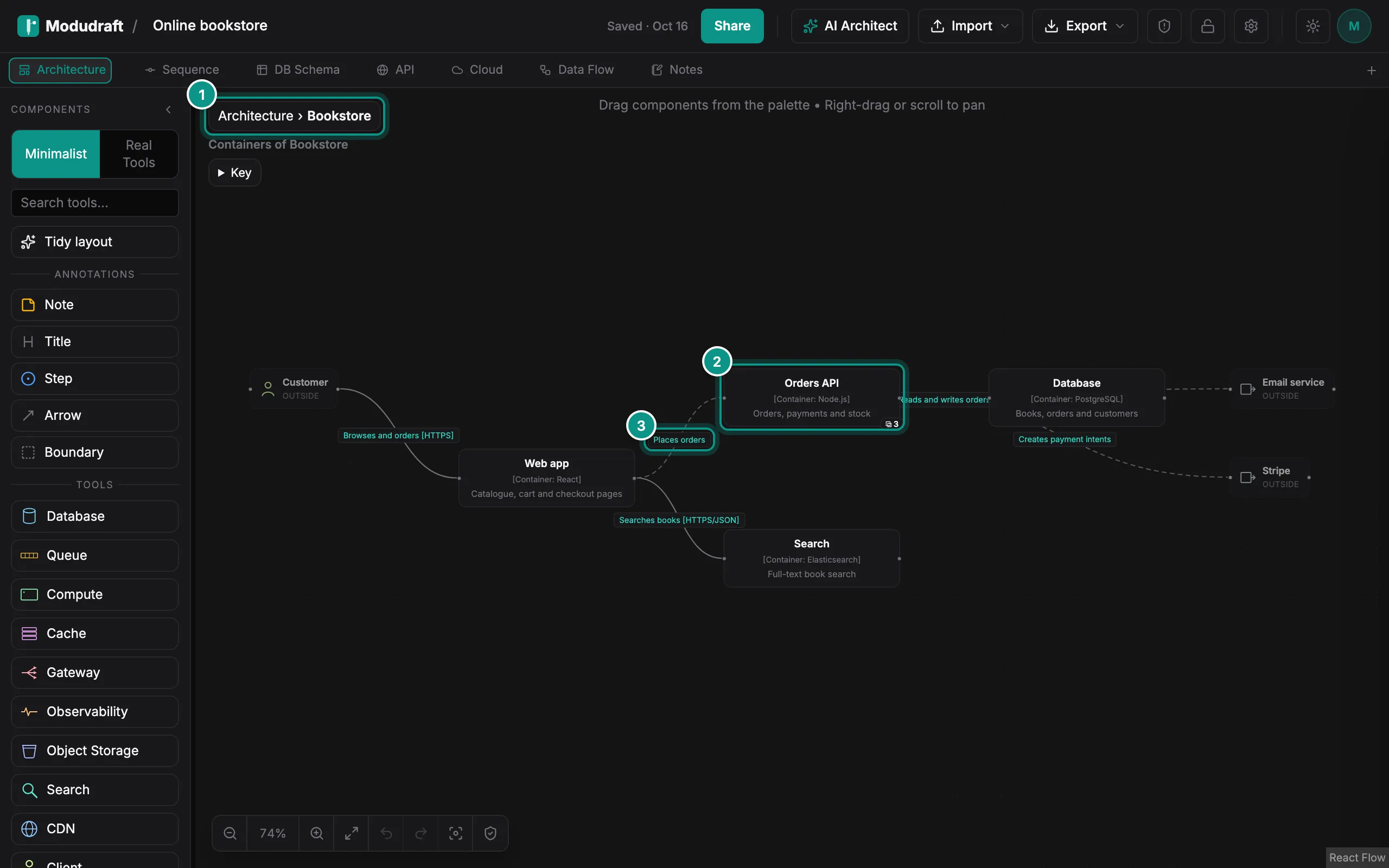
A component can hold other items. Double-click it to open it, and the canvas shows what is inside. You can also right-click it and choose Open inside.
Here, Bookstore is open. The breadcrumb at the top left (1) shows where you are: click Architecture to go back up, or press Esc with nothing selected. Inside you see its containers, such as Orders API (2).
When an arrow connects items on a deeper level, the levels above show it as a dashed arrow between the components that hold them (3). You do not draw these arrows. Modudraft keeps them up to date for you.
The address bar follows the open level, so a copied link opens inside the same component. The Levels and C4 docs explain moving items between levels and the C4 look.
Change the look
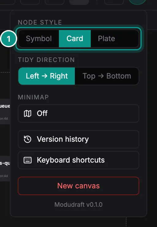
Open Settings in the toolbar and pick a node style (1):
- Symbol draws each component as a large icon with its name.
- Card draws a box with the name, the kind and a few properties.
- Plate draws a tinted tile with a centered icon.
To swap symbols for real logos, switch the palette to Real Tools, or press M on the canvas. Press M again to go back.
Next, show how a request moves through these components in the Sequences guide.